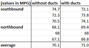
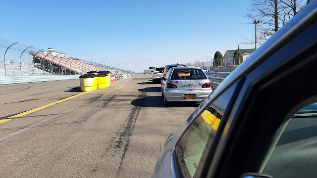
Lined up and ready to head out on track at the 2022 Green Grand Prix , an annual fuel economy competition held the Friday of opening weekend at Watkins Glen International. We all know that reducing drag can improve fuel economy. It’s intuitive but can be proven mathematically: when your car has less force acting against it, it takes less fuel (gas, diesel, or electric) to move. But what is the exact relationship between aero drag and economy? Can we measure it? Or predict it? Figuring this out can help us plan modifications to our cars with the aim of improving economy, as well as tell us if fuel economy is an accurate measure of changes in drag. ETA 5/18/2026: Since writing this post, I've learned more about how to model fuel economy in cars. It comes down to efficiency (thermal, propulsive, and overall) the magnitude of resistance force, and the energy available in fuel sources like E10. See this article on efficiency for a better explanation, how to evaluate online ...


Comments
Post a Comment